Showing images (and more) in a UComboBoxKey widget
 Imagine if you will that you are working away at constructing a widget
blueprint. You are carefully translating the immaculately sketched,
delicately executed statements of cutting-edge graphical paradigms,
and modern, dynamic layout that were grudgingly bestowed upon you by
your UI designer (during a brief interlude between animated debates
about the merits of curved buttons versus straight buttons, and the
role of the colour purple in signalling state.)
Imagine if you will that you are working away at constructing a widget
blueprint. You are carefully translating the immaculately sketched,
delicately executed statements of cutting-edge graphical paradigms,
and modern, dynamic layout that were grudgingly bestowed upon you by
your UI designer (during a brief interlude between animated debates
about the merits of curved buttons versus straight buttons, and the
role of the colour purple in signalling state.)
If you do not have a UI designer, feel free to imagine yourself wearing a black turtleneck and a condescending expression for the same effect.
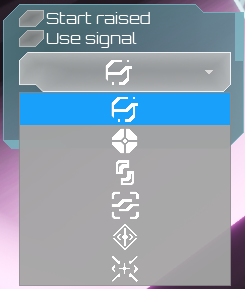
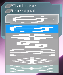
ANYWAY, amidst the buttons, bars, and borders you discover there is a need to present the user of your user interface with an interface that allows the selection of an image from a list of images: a dropdown list of images if you will. This is apparently not negotiable without interrupting a 3 hour symposium that will inevitably descend into factional disagreements over lists and checkboxes, so a dropdown it must be.
UComboBoxString v UComboBoxKey
The first thing you may notice, while gazing forlornly upon the Input category
of the widget palette, is that Tim Epic gives us not one but two types of
ComboBox. One has the mysterious and obtuse suffix (String) while the other
has (Key), and the tooltips for the two are nearly the same. However, neither
seems to mention images at first glance. Despondent at this you might attempt
to glean advice from the documentation. There's nothing like good documentation,
and as all Unreal users can agree its documentation is nothing like good
documentation. In this case, it's as much use as a chocolate fireguard.
Eventually it may become clear that that the "Use OnGenerateContentWidgetEvent
to return a custom built widget" part of the ComboBox (Key) tooltip is a clue.
On plonking one down in your widget blueprint you will notice that there are
two events you can do things with: there's the OnGenerateContentWidgetEvent
alluded to in the tooltip and its companion OnGenerateItemWidgetEvent. Those
sound very much like things that expect you to create your own widgets to show
in the content area of the box, and for each item in the dropdown respectively.
This is because that's exactly what they are - although good luck getting
that from the docs. And you can make the widgets be basically anything you
want: everything from a simple Text box up to a panel containing multiple
widgets!
In short:
- Use
ComboBox (String)if you just a dropdown that only contains strings (not even Text - just strings!) - Use
ComboBox (Key)for dropdowns containing anything else
An actual example
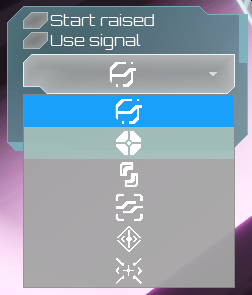
If you've made it this far through the somewhat hyperbolic prose, you'll want to see how to do this - and honestly, many of the other almost-explanations of this I have managed to find for this go full-on Draw The Rest Of The Owl here so without further tangents or hyperbole 1 I'll explain how I got the image list dropdown shown in the screenshot above to work.
The Options list
Once you've added a ComboBox (Key) to your widget blueprint, style it as
needed - I won't go over this, because the style options are largely the common
ones you find for all the other widget types, and thankfully they're mostly
self-explanatory.
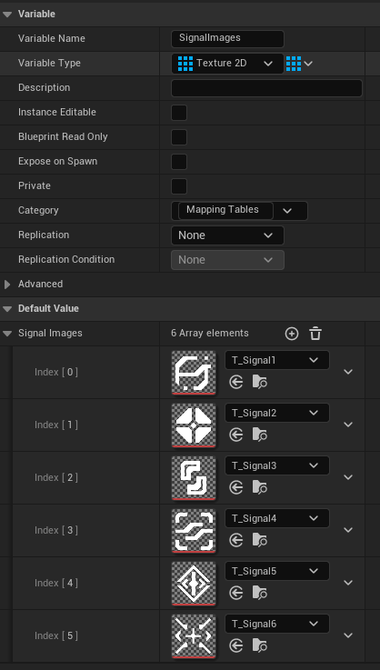
What might throw you is that the Content -> Options list is just an array of
Names, similar to the ComboBox (String)'s array of strings. This
is where you'll need to think a little laterally. What I did was create an
array of Texture2D object references to store the list of signal images23:
And then on constructing the widget blueprint that contains the Signals dropdown I add entries to its options list, one for each array element:
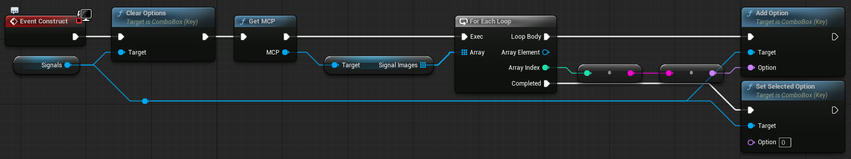
So now there's a list of Names that are really just indexes into an
array, and the corresponding array of images. Now we need to make images
appear.
Showing the images
The naive thing to do at this point is to click on the On Generate Content Widget
button, click on + Create Binding and set up a function like this:
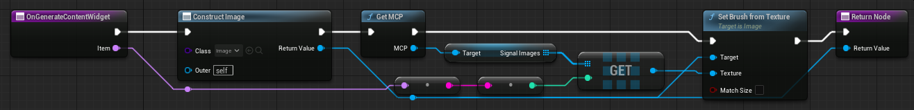
the function creates a new Image object, converts the Item name to a
string, then an int, uses that to index into the SignalImages to get
the texture to show, sets the brush in the Image from that texture, and
returns the result. Set the On Generate Item Widget event to call the
same function and...
Well. It sort of works! The problem is obviously that the Image is being sized to fill the container, but the image should be shown as a square, not stretched to near-unreadability across a rectangle!
Showing the images properly
But we can make any widget and show it in the combobox, which means there are ways to avoid such a stretchy and distorted fate. Create a new widget blueprint (I called mine WBP_Editor_SignalBox because that's where it is being used: signal comboboxes in the editor) and do something like this:
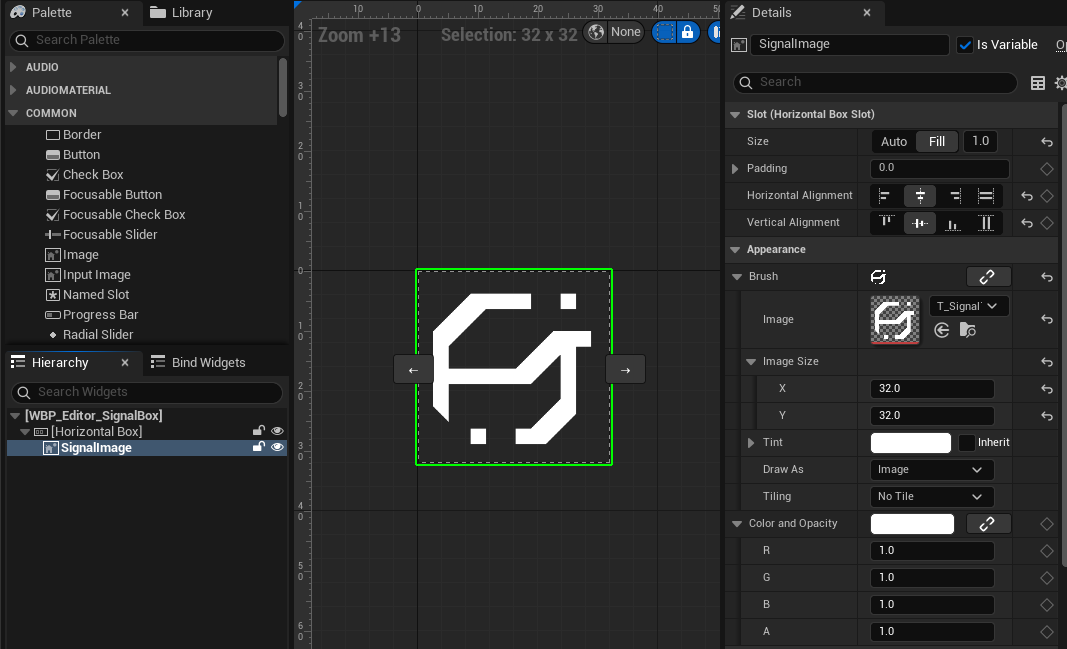
That is, an appropriately sized image inside a Horizontal Box, set up to be centre aligned horizontally and vertically. I also added a function to that widget blueprint that let me set the texture drawn in the image4:
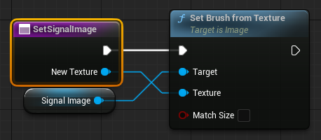
With that in place, the OnGenerateContentWidget function for the dropdown
can be updated to create an instance of the newly-defined widget blueprint:
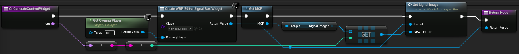
This does much the same as the previous one, except instead of an Image it
creates a new WBP_Editor_SignalBox and sets the texture shown in the image
via the SetSignalImage function. With that change made, success!
Some extra thoughts
One thing to note is that you don't necessarily need to use an array of textures here - you could have a more complex setup where you have an array or map of structs with more data in there. I'm using an array of textures because the situation is pretty simple. It would be fairly trivial to extend this so that instead of just an image, there's an image and a Text box to show a name next to the image. It's entirely possible I may end up doing that in my level editor.
As you're providing a widget for each item and the contents of the dropdown button, you could conceivably have different layouts for each, and even have the dropdown list vary so that even rows get one type of widget, odd ones a different type, just be careful to not go overboard otherwise you might get even more condescending stares from the UI designer (real or imaginary...)
-
further tangents and hyperbole not guaranteed to be absent. ↩
-
why is the first image Signal1 and not Signal0? Because we do not talk about Signal0 any more. Some things are best left forgotten. ↩
-
The array is stored inside the Master Control Program (my GameInstance) because where else could it possibly go? ↩
-
this isn't necessary, you can just reach into the widget and set it directly, but I prefer the encapsulation. ↩